Document Generation
Althea’s literature review pipeline now generates structured scientific documents with embedded figures, data tables, and formatted notation. The result renders inline, not as a flat text summary.
What changed
Section titled “What changed”Up until now, questions about papers were answered in plain text: headers, bullets, prose. Useful, but lossy. Scientific papers communicate through figures, tables, and spatial layout as much as through words. Strip those and you’re throwing away half the signal.
Now Althea extracts and can render answers in the full visual vocabulary of a source paper: architecture diagrams, distribution plots, comparison tables, captioned figures. The output reads like a bespoke, concise technical report.
Why we built this
Section titled “Why we built this”We’re researchers. We read a lot of papers. The actual workflow is: skim fast, decide if something’s relevant, then selectively go deep on the parts that matter. What you need first is a glanceable version: something that preserves the key figures and results so you can make that relevance call in 30 seconds instead of 10 minutes.
Once something catches your eye, a surprising result in a table or an architecture choice in a diagram, you want to jump straight to that section in the original paper. So every figure and table in Althea’s generated documents links back to the exact location in the source PDF.
Example: Gravitational-wave parameter estimation
Section titled “Example: Gravitational-wave parameter estimation”A researcher asks Althea to summarize arXiv:2512.02968, a paper on DINGO-T1, a transformer-based neural network for flexible gravitational-wave parameter estimation.
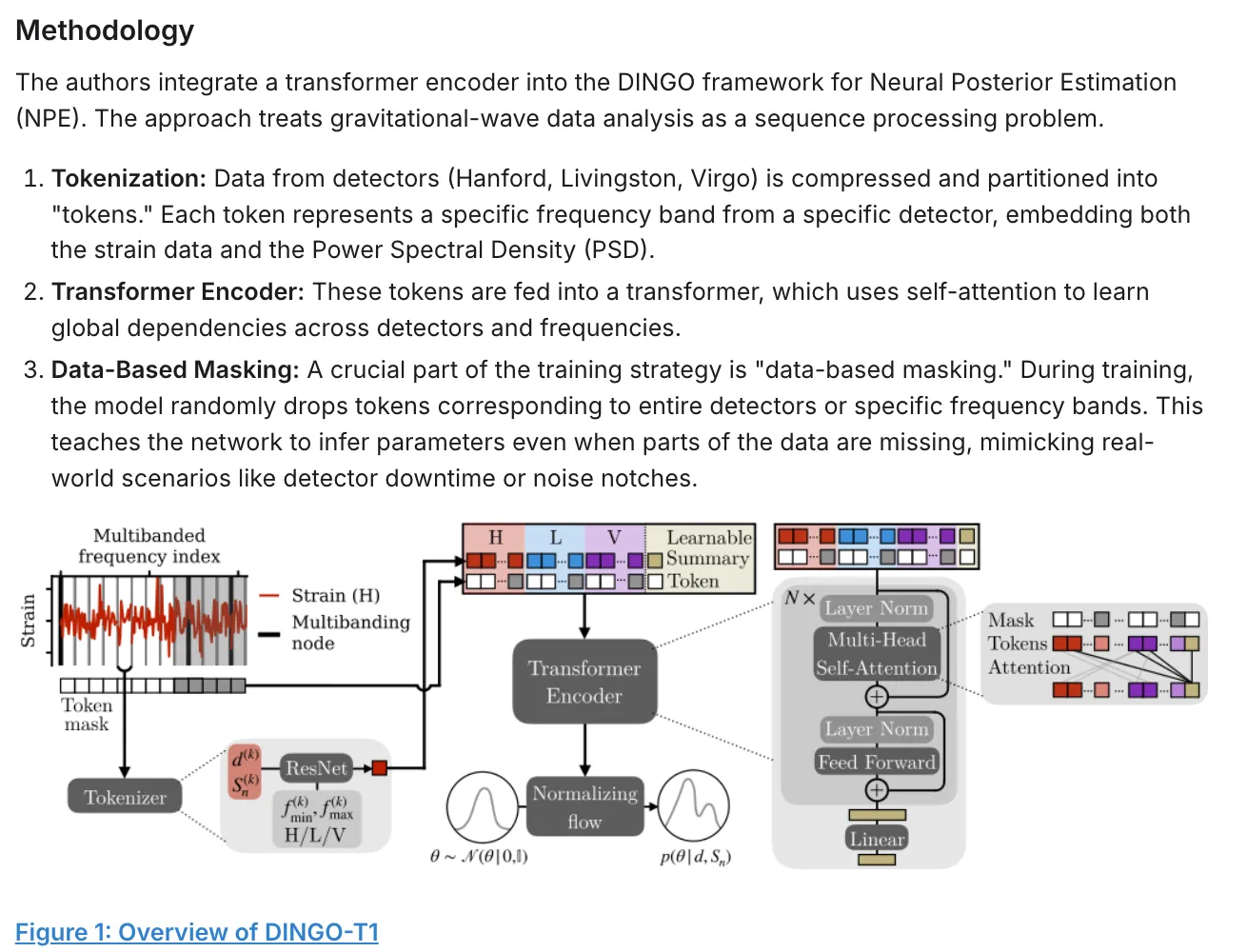
The generated document opens with a structured overview of the paper’s contribution, then walks through the methodology with the original architecture diagram intact:
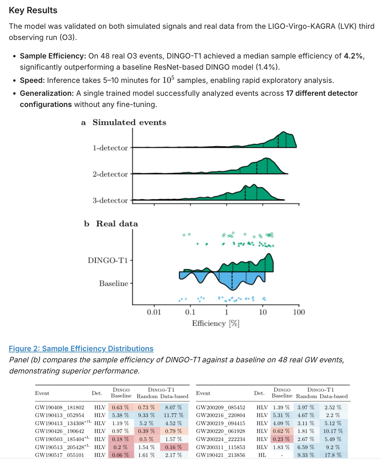
Results section preserves the efficiency distribution plots and presents per-event performance data as a formatted table: 48 real gravitational-wave events with detector configurations and sample efficiencies side by side.
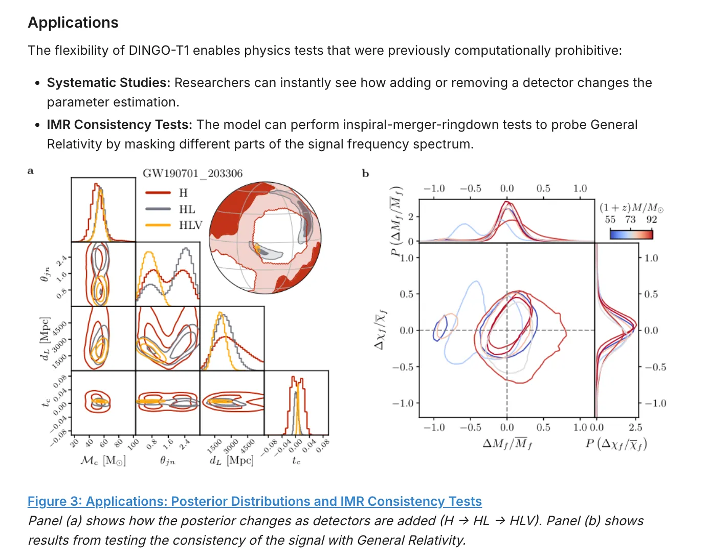
Applications section retains the posterior distribution plots and IMR consistency test figures, with captions explaining what each panel shows:
Why this matters
Section titled “Why this matters”This functionality is especially relevant for physics, biology, and engineering, fields where the figures are the primary result. A posterior distribution plot communicates more than any paragraph describing it.
Generated documents can be sent through email or WhatsApp, with richer views available in the web app.